How do we imagine and illustrate outer space? Lois Rosson, a PhD candidate in the UC Berkeley Department of History, focuses on the history of astronomical illustration as a lens into the history of science and technology. She worked at NASA for two years before starting graduate school, and recently completed a research internship at Lawrence Livermore National Laboratory. She has held fellowships at the Smithsonian’s National Air and Space Museum, and the Huntington Library. Her background is in studio art, and she is primarily interested in the ways both artists and scientists construct visual truth claims.
Matrix content curator Julia Sizek interviewed Rosson about her dissertation research, drawing on astronomical illustrations that Rosson features in her work.
How did you become interested in the role of artists producing astronomical images?
I came to this project via a somewhat zigzagged trajectory. My undergraduate training is actually in studio art; I was very interested in portraiture. I didn’t have the vocabulary for this at the time, but what I was really interested in was mimesis, or how someone could paint an image of another person that could be recognized as “realistic.” In portraiture, there are thousands of ways to produce a painting that resembles an individual, but we don’t use the rubric of accuracy or objectivity to make sense of this relationship.
When I was an art student at Santa Cruz, there was an interesting split between painters who used photography as reference material and those who didn’t. The paintings people colloquially described as “realistic” typically used photography as a tool in the visualization process. What I noticed was, most of the time when people used the term realistic, what they actually meant was photographic.
When I graduated, I got a job doing graphic design at NASA’s Ames Research Center. NASA as an organization is great at preserving its own institutional history, and each of the ten NASA centers has its own history office that maintains a local archive.
The history office at Ames has an incredible collection of illustrations NASA commissioned to visualize the unmanned satellite and probe missions of the late 1970s. These images were circulated in print, so their final form was fairly small, but in person they are really large and stately-looking art objects. I couldn’t resist the urge to describe the type of realism they deployed as a photographic one. But what photographs do you use as reference material when you’re painting a largely unobserved topography? No one had ever seen the surface of these planets from these vantage points with the naked eye. I wanted to know more about how these artists were trained, and what kinds of reference material they were using.
From there, I got very interested in the conceptual differences between fine art and scientific illustration. Astronomical illustration was especially fascinating, because space has historically been such a difficult subject to visualize. I discovered that these illustrators were often trained as artists, but that the illustrations they produced were circulated as a sort of neutral scientific image. A lot of times, the illustrations were simply attributed as anonymous “artist’s depictions,” in ways that downplayed an individual illustrator’s interpretive lens.
I left Ames after two years to start a doctorate in history, and work with Berkeley’s resident historians of science. The history of science is really a study of how groups of people produce truth, and since I was interested in why certain images are read as more “real” than others, it felt like a great fit intellectually.
These images come from the Mariner 9 mission, which was the first mission to orbit another planet. Can you describe the process and techniques that they used to sharpen their images?
The Mariner 9 images are really fascinating because we used artists to literally help us “see” it better. Artists at the USGS took fuzzy Mariner 6 and 7 images and redrew them into a smoother, more coherent landscape. Then, by the time Mariner 9 sent back slightly clearer images, we used those earlier drawings to help us make sense of what we were seeing. In this case you have human observers collapsed into a larger, institutional “seeing” apparatus, which is why their identity as artists is collapsed into a process that sounds almost mechanical. These artists make visual observations, and then transcribe what they see. In my dissertation, I argue that astronomical illustrators exerted much more autonomy over their images than we typically account for, and that they actually held quite a bit of purchase over the “look” of outer space that emerged over the course of the twentieth century.
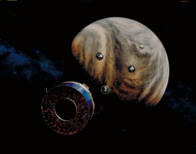
While the black-and-white image is a composite from the Mariner 9’s cameras, the color image comes from an artist rendering from the same mission. What did the production process look like for artists rendering images of Mars, and what does this show us about the relationship between science and art at this time, which you call “astrorealism”? How do the processes of astronomical illustration compare to scientific illustrations in other fields?
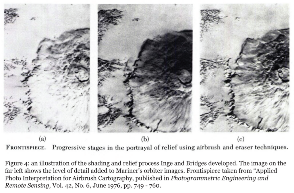
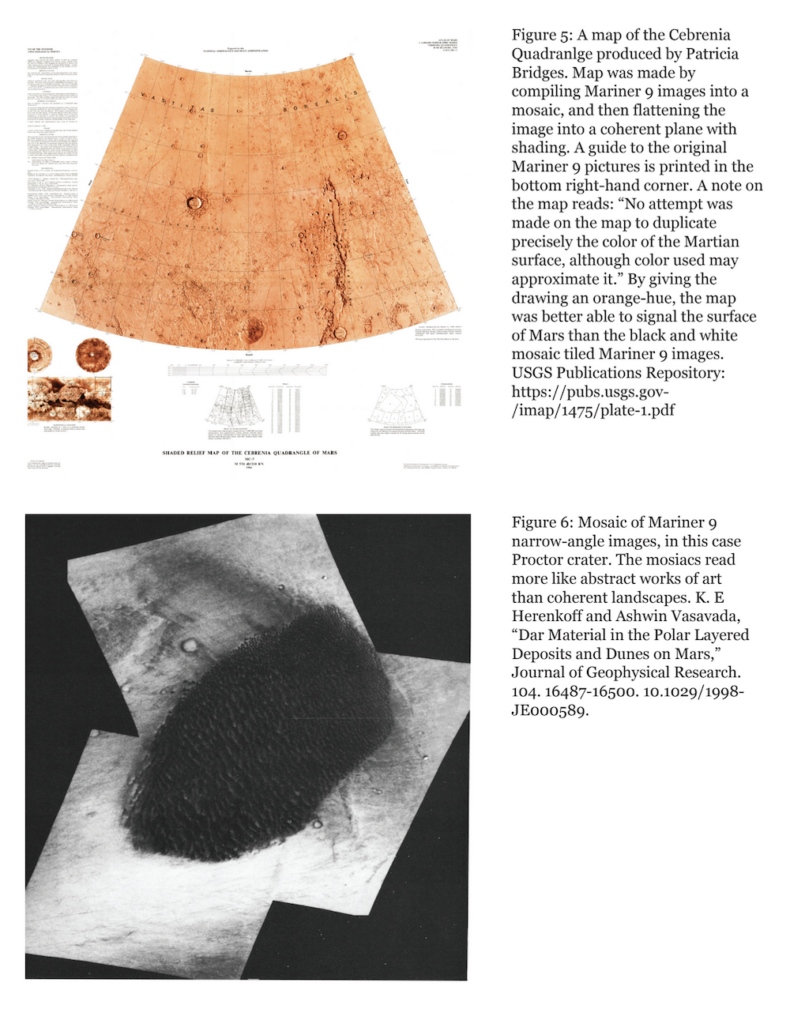 The Mars mapping efforts of the early 1970s — the maps we made with Mariner images — were actually made with a set of techniques developed in the 1960s for mapping the lunar surface in preparation for Project Apollo. In the early 1960s, photographing the Moon with high enough resolution for effective mapping was fairly difficult. The solution was to hire artists to come in and bolster the resolution of fuzzy photographs by hand with an airbrush. Patricia Bridges refined the technique of airbrush editing at Lowell Observatory, and trained a whole roster of illustrators in the process. She used a lot of the same techniques again in the 1970s to make clearly legible drawings of the Martian surface.
This is largely a story about artists being deployed to “see” in situations where cameras can’t, and I argue that the maps produced during this period were largely contingent on replicating images that could be read as sufficiently photographic. There’s a growing literature in the history of science about the history of scientific photography, and the ways in which it displaced human illustrators in botany and medicine not because the images were necessarily “more objective,” but because viewers were anxious about human fallibility and trusted mechanical reproductions to be more neutral. The epistemological anxieties baked into the way we read hand-drawn images are part of the reason the artists in my story were cast as passive transcribers of astronomical information. In reality, they were just teasing out photographic-looking clarity from ambiguous scientific images.
“Realism” is the most confounding word in the entire dissertation project. In art, you have French Realism, photorealism, Socialist Realism, hyperrealism, etc. They all mean slightly different things, and usually refer to a specific historical movement as opposed to “naturalism” or mimesis, which typically refer to attempts at visually inscribing reality in some way.
I coined “astrorealism” after Douglas Dewitt Kilgore’s “astrofuturism,” which treats a lot of space advocacy work in the 1970s and 80s as a body of fictional literature. That’s not to say what these advocates were doing was fake, but by framing it as a form of literary futurology, you can tease apart the cultural meaning baked into descriptions of humanity’s place in the cosmos. For me, astrorealism refers to the artwork that accompanied much of this writing. The astrorealist impulse is one that depicts space accurately in an attempt to make space futures seem more tangible. There’s a long history of these landscapes being framed as a form of scientific illustration in order to differentiate them from science fiction art. This is typically done to make the views seem more scientifically plausible, which is useful if you’re trying to convince a wide audience about the feasibility of an orbital space colony.
In this image, we can see artist Donald Davis producing what became “The Two Former Faces of the Moon,” renderings of what the Moon used to look like. How did these illustrations circulate, and how did they shape American understandings of outer space?
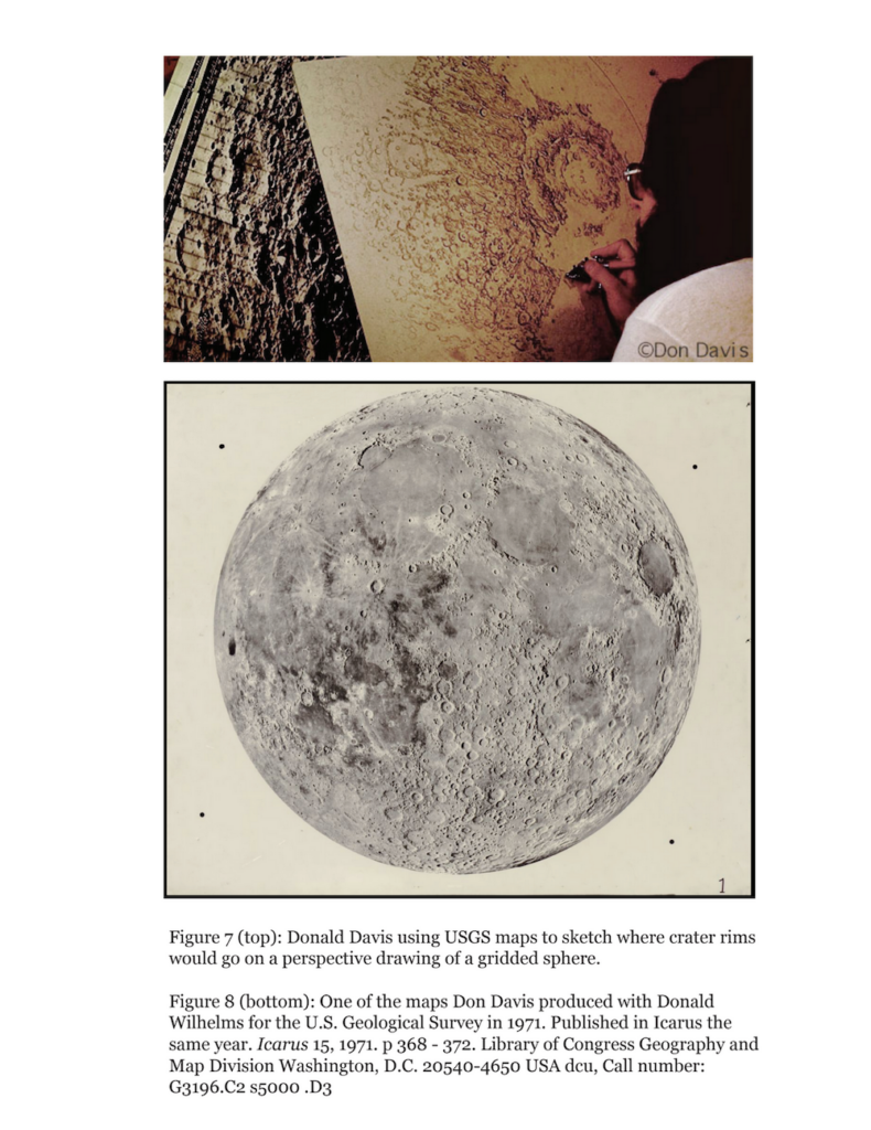
Don Davis’s career is an incredible through-line through most of the dissertation project. He was hired by the U.S. Geological Service’s Branch of Astrogeologic Studies in the late 1960s, while he was still a high school student in Menlo Park. Because large-format color printers did not yet exist, the agency hired high school students to hand-color maps with a numerical coding system, much like a large color-by-number picture. Davis’ artistic dexterity was quickly noticed, and in 1971 he was sent to Flagstaff to help support the Mars mapping project that was newly underway. While in Flagstaff, Davis came under the tutelage of none other than Patricia Bridges, who by this time had a decade of experience using airbrushes on astronomical images.
Around the same time Davis relocated to Flagstaff, Donald Wilhelms, one of the USGS’s planetary geologists, had an idea for a project that would deploy Davis’ talents as a transcriber of visual astronomical information. In a gesture to the Moon maps produced by Lowell in the early 1960s, Willhelms wanted to produce a series of images that illustrated earlier periods of the Moon’s history. They collaborated on a paper published in Icarus titled “Two Former Faces of the Moon.” In it, Wilhelms described what the lunar surface looked like at various points in its history and paired his analysis with Davis’ detailed airbrush drawings of the Moon. Just as Bridges helped fill the gap cameras couldn’t, Davis’ used her techniques to make visible a view of the Moon humans could not photograph or view through a telescope. In this case, the views he was clarifying were unphotographable because they existed only in the past.
The paper was a pivotal moment for Davis’ career. Just after the publication of “Two Former Faces of the Moon,” Davis attended a party at a commune owned by Joan Baez. Carl Sagan, also in attendance, was the editor of Icarus and remembered the drawings of the Moon Davis had produced. Sagan was impressed by the series, and the meeting kicked off what would become a long and fruitful set of collaborations. Davis produced several illustrations for Sagan’s books over the course of the 1970s — including the cover of Dragons of Eden — and joined the Cosmos Art Department in 1979 when production for the television series began.
Davis went on to enjoy a highly visible career in the field of astronomical illustration. In addition to his many collaborations with Carl Sagan and JPL, Davis helped produce one of the 1970s’ most iconic visions of space. In 1974, Davis spotted a newspaper article titled “Princeton Plan for a New Frontier: A Space Colony by the Eighties,” written by Gerard K. O’Neill. The article outlined a plan for developing a space colony as early as the 1980s, and for no more money than the Apollo Program. In Davis’s view, O’Neill, a Princeton physicist, had the credentials necessary for this to be a reasonable claim. Davis was intrigued and reached out to O’Neill to advertise his services as an astronomical artist. In response, O’Neill sent Davis a newsletter with drawings and early ideas on the subject. Davis used these to produce a painting of one of the cylindrical space colonies O’Neill described in his plan.
Davis’s collaborations with O’Neill are a prime example of how the brand of scientific realism cultivated at Lowell Observatory helped develop the look of outer space in the public imagination. Davis was trained to make his images appear as plausible as possible by rooting his art in photographic reference material. O’Neill, actively trying to sell Congress on the viability of a 10,000-person space station, wanted images that appeared as realistic as possible. O’Neill and Davis’ 1975 Space Station Design collaborations are some of the most visually iconic artifacts of the post-Apollo period. Their production was contingent on Davis’ training as an astronomical illustrator, and the belief that artists can be deployed in the absence of cameras to document scientific information.
In other instances, art became a means to express what were seen as the limits of human expression, and a response to earlier modes of nationalist space exploration. What does the art included on the Golden Record show us about how the politics of space exploration and ideas about space are changing in the 1970s and 1980s?
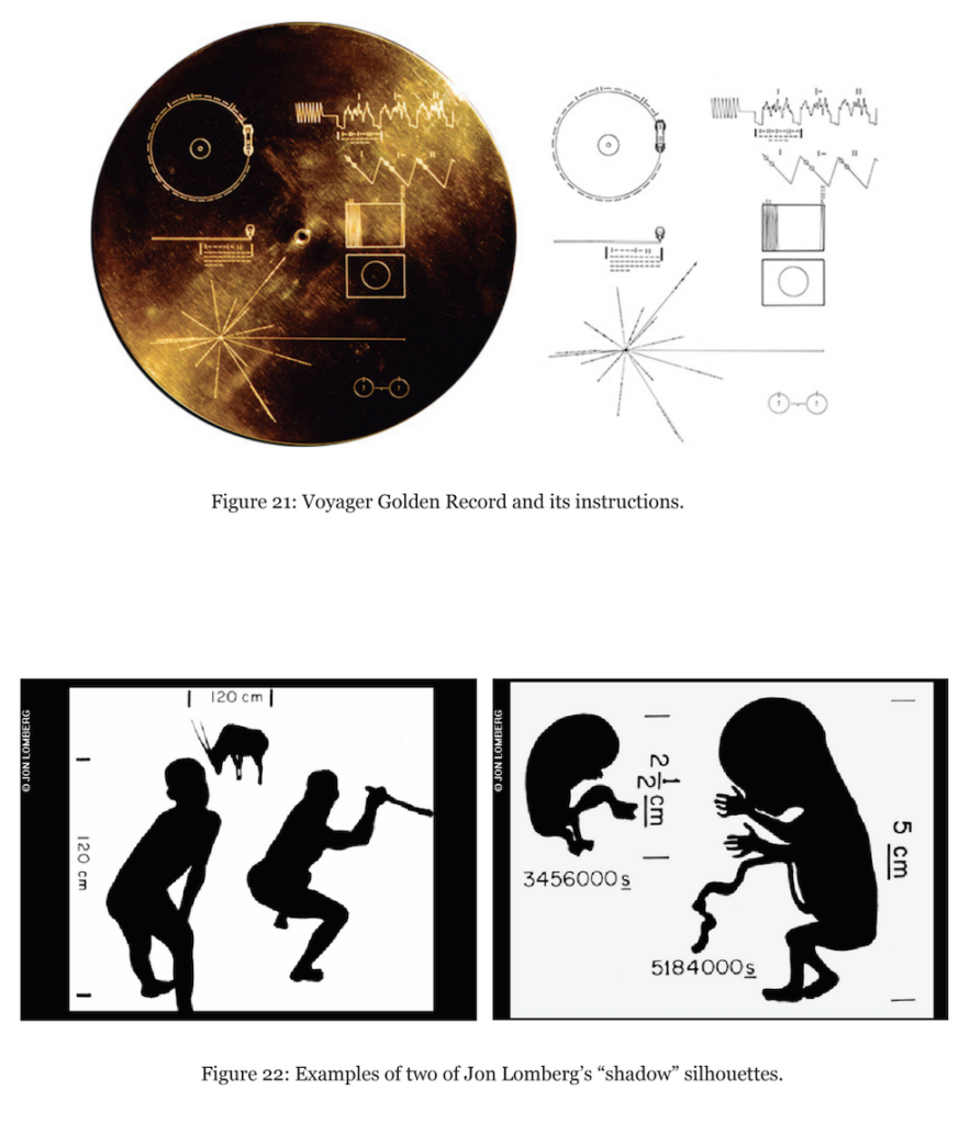
Outer space is the perfect cultural Rorschach test. What’s fascinating about the Golden Record is that it represented an attempt to produce a snapshot of life on Earth, and attempted to make it legible to an imagined alien species.
As an artifact, it’s also a great representation of how space advocacy changed over the course of the twentieth century. Carl Sagan’s approach to drumming up support for new space ventures was a dramatic departure from the space boosterism of the 1950s. Rather than celebrating space exploration as an activity that would cement American hegemony in space, he framed the cosmos as an intellectual antidote to aggressive political impulses. The hardware that allowed space science to cohere into a bounded discipline in the mid-twentieth century was not a function of the same defense-minded spending habits that gave us nuclear weapons, but rather part of a much older tradition of astronomical observation. He framed space science as part of an ancient practice of human star-gazing, rather than a set of technologies similarly borne out of Cold War conflict. This rhetorical move allowed him to use scientific practice as a vehicle to critique the military-industrial-academic crucible that created a U.S. missile program, in spite of muddled historical boundaries. In Sagan’s view, which was reiterated in his popular writing and television appearances, the cosmos offered the type of humbling perspective the political squabbles of the 1970s so desperately needed.
The Golden Record’s emphasis on a single human race inhabiting a single planet is a great encapsulation of this philosophy. At its conceptual core, the project’s goal was to produce an object that represented the non-technical dimensions of Earth, and to communicate them to an imagined alien species. Jon Lomberg, one of Sagan’s long-time artist-collaborators, was tasked with collecting a range of images that described human life in a coherent way. Of course, no totalizing narrative of Earth could be communicated in 116 images; the selection included says much more about the compilers of the record’s contents than anything essential about life on Earth in 1976. There were diagrammatic images meant to describe concepts believed to be universal: lists of mathematical equations, a diagram of a DNA helix, as well as a chart describing the distances between all the planets in our solar system. There were also photographs of various human activities: one image showed three people eating and drinking, while another showed a baby breastfeeding. Olympic athletes, a teacher, and a woman at the grocery store were shown, as well as several city-scapes, cars, and Titan Centaur rocket.
Lomberg’s participation in the project is largely unknown, and is my favorite part of the Golden Record’s creation. Lomberg was concerned that, even if an alien civilization intercepted the record and was able to decode the disc, they might not be able to read photographs as containing any intelligible information. In his view, “not even all people can necessarily read photographs” unambiguously, and that most people take for granted the extent to which the ability to decipher visual information is a learned skill. His solution, which I think is fascinating, was to include eleven drawings on the record that broke down visual information into black and white shapes. He concluded that if an alien organism were ever to encounter the record, its physical ability to decipher visual information encoded by humans would warrant proximity to some sort of star system. In other words, if an alien being were to “see” visual information the way humans do, it would likely be the result of evolutionary sensitivity to a centralized light source. Thus, Lomberg’s solution was to depict certain forms as shadows. If the hypothetical alien observer had any familiarity with light emanating from a single source, then it was likely familiar with the concept of a shadow. If it was familiar with shadows, it might also understand that they represent complex physical objects in two-dimensions. If it got that far, it might also realize that the rest of the images on the record were two-dimensional representations of three-dimensional beings and structures.
While many images of space sharpened actual images, others imagined new frontiers in space. In these images, Donald Davis imagined donut-shaped spinning space colonies that physicist Gerard O’Neill’s envisions in a 1974 Physics Today article. How did these designs reflect the relationship between astrofuturism and astrorealism, and in what ways were these visions inspired by life on Earth?
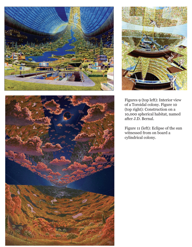
I’m always fascinated to learn where the artists in my story source their reference material. When you’re depicting an unobservable topography — or, as in this case, an imagined one — it’s easier to deploy an existing reference as a proxy. Gerard O’Neill had worked out the basic architecture of the structures in his plan, but the look of the interiors still needed to be filled in. I had the pleasure of interviewing Don Davis about his working process in 2020, and when I asked him about the space station designs, he emphasized that the landscapes around him played a significant role in the visual formulation of O’Neill’s space colonies. He had recently moved back to Northern California from Flagstaff, and used the rolling green hills of the San Francisco Bay Area to inform his work. He considered trees and other natural features to be integral to a pleasant living experience, but also an important nod to the types of ecosystem design that would be necessary on a self-sustaining colony. Davis felt that would be as big a challenge as anything else and wanted to make sure environmental engineering was an implied task in the illustrations he produced.
Don Davis’ illustrations provide a clear material link between Gerard O’Neill’s space station designs, and Douglas Dewitt Kilgore’s analysis of them as literary objects that cast outer space as a type of suburban frontier. According to Kilgore, O’Neill’s design was the astrofuturist’s answer to the economic and political ills of the 1970s. The energy crisis on Earth wouldn’t be a problem for orbiting space colonists, who could tap into the limitless supply of solar energy offered by the sun. Resources scarce on Earth could be mined from the surface of the Moon, and the absence of gravity meant the construction and expansion of space station structures could continue into perpetuity. O’Neill’s answer to the resource limitations of Earth was not to re-examine consumption, but rather to extend the possibilities of capitalist growth indefinitely into a new and endless frontier.
This would presumably also help ameliorate the political problems of the 1970s. By giving different groups of people the resources they needed to live independently, governments wouldn’t need to mediate their peaceful coexistence. Groups could self-organize however they pleased and splinter off to form new colonies, should the need arise.
At the time that Davis began collaborating with Gerard O’Neill, he was living in Atherton, a suburb south of San Francisco, close to his first job at the USGS. Atherton’s surrounding natural landscapes greatly influenced the look of the interiors of the space colonies Davis produced, but so did the layout of the city itself. Davis’s designs deliberately included a lot of greenery, foregoing the dense “shopping mall” aesthetic he often saw applied to space colonies. The beauty of O’Neill’s design was the prospect of infinite expansion, which eliminated the need for cramped space stations and the miserly economization of resources in an extreme environment. Atherton was a wealthy suburb, and a perfect example of the low-density housing Davis thought represented ideal living conditions.
I think this is a great example of the ways in which these images function as robust historical artifacts. Kilgore observed that the embrace of the suburban pastoral in space station design mirrored the same impulses that drove white flight out of urban environments in the same period. As with the new suburban neighborhoods sprouting up across the United States, Davis’ colonies implied the existence of life on the idyllic periphery of an industrial center. I think this is especially evident in illustrations of O’Neill’s toroidal designs, spinning rings that simulated gravity using centrifugal force. In a visual sense, the colonies are a suburban halo around a city that has ceased to exist. The problems of city life have been literally absented, leaving only a verdant and harmonious mode of existence.
How did astronomical illustrations change after the 1970s, and what does this tell us about the relationship between art and science today? How has the field of astronomical illustration changed today?
I think the visualization efforts of the late 1970s—when we had to rely on largely unmanned satellite views of distant cosmic neighbors—really resulted in a critical mass. By the early 1980s space art and astronomical illustration actually professionalized into a formal guild with its own in-house journal. I have an entire dissertation chapter about a trip they took to the Soviet Union in 1987 to meet with a parallel guild of Russian space artists, and the differences between their respective approaches. As you might imagine, both groups cultivated very different philosophical approaches to representing the cosmos.
The International Association of Astronomical Artists, or the IAAA as they were abbreviated, is actually still around today. There’s definitely less of a market for handmade illustrations than there was closer to the mid-twentieth century, but outer space is still extremely hard to make visible.
A few years ago I had the opportunity to interview Dana Berry, who worked on Hubble imaging at the Space Telescope Science Institute at Johns Hopkins. The question of how to represent space subjects in an intelligible way was still a pressing one, even with the use of digital image processing tools and the help of a space telescope.
In Berry’s view, science visualization is a competition between believability, pedagogy, and accuracy. For instance, if you’re trying to show the solar system on a computer screen, you have to be able to show the planets. In reality, they’d be so small they’d fall between pixels. In order to scale the planets up in a way that viewers can recognize, accuracy has to take a hit. So in this way, pedagogy and believability win out.
Berry emphasized that is especially true with representations of the Big Bang. To keep with the computer screen analogy, the Big Bang is usually shown as an empty screen, and then a pixel emerges, and blows up to include the entirety of the frame. But the problem with this visualization is that the Big Bang created space as well as time, so the computer screen technically didn’t exist yet. We’re trained to think of the universe as emerging from a single dot suspended in space—how do you show something expanding into a realm that doesn’t exist yet? In these views, accuracy takes a backseat to believability.
To answer your question, while we don’t see many handmade illustrations of space these days, we’re still very much grappling with the same kinds of questions that astronomical artists were trying to figure out over the course of the twentieth century. Space is hard to conceptualize, which makes it hard to see. I think our attempts to picture it will always inevitably function as cultural products.