
Kate Pennington is a research economist at the Center for Economic Studies, a division of the U.S. Census Bureau; she earned her PhD from UC Berkeley’s Department of Agricultural and Resource Economics in 2021. Her current work focuses on diverse questions related to inequality and urban issues.
Among her current projects, she is collaborating with PhD candidate Eleanor Wiseman in investigating how the water crisis in Flint, Michigan shaped political participation and voting behavior among residents, and she studies how economic shocks like the Great Recession affect access to reproductive healthcare. Her research has been funded by the Institute for Research on Labor and Employment, the Upjohn Institute for Employment Research, the Institute for Women’s Policy Research Fellow, and the National Science Foundation.
Matrix content curator Julia Sizek interviewed Pennington about her recent research on housing and displacement in San Francisco, which won the 2021 Urban Economics Association Prize for best student paper. Her paper, “Does Building New Housing Cause Displacement?: The Supply and Demand Effects of Construction in San Francisco,” explores the impact of new housing construction on rents, displacement, and gentrification in the surrounding neighborhood. Her work disentangles the supply and demand effects of new construction and compares the different impacts of market rate and affordable housing. (Please note that questions and responses have been lightly edited.)
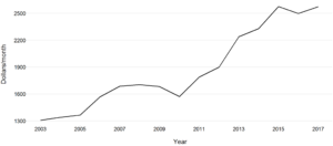
As we can see in this graph, rents have been increasing steadily in San Francisco, and have been climbing dramatically since 2010. Gentrification has long been a hot topic in San Francisco and the Bay Area, especially as the tech sector has brought new — and wealthy — residents to the peninsula. Given all the data that has been collected on this subject, what did you find to be missing? How did you decide to study this topic?
This is an issue that people care about deeply, but there’s a lot of disagreement on how cities should respond to rising housing prices and demographic change. The construction of new, market rate housing — housing that isn’t restricted to low-income residents — is really controversial because of fears that it may actually accelerate neighborhood change. To me, this is an open empirical question. What is the impact of new market rate buildings on the surrounding people and neighborhoods? I wanted to try to answer this question to help move the discussion forward toward a solution.
The question is difficult to answer because it’s hard to tease apart causation and correlation. Because of the tech boom, higher-income people are moving to the Bay Area, and that’s driving up rents and displacement. Developers want to make money, so they like to build in places where prices are already rising. That means that new market rate housing is positively correlated with rising rents and displacement, but it doesn’t mean that the new buildings are causing the neighborhood change.
The challenge here was to find a natural experiment in housing construction that could help me identify the causal impact of construction on rents and demographic change.
In your paper, you combine data on new construction with data on structural fires and Craigslist rents. Why did you end up using these forms of data to track changing housing conditions in San Francisco?
The ideal way to determine whether new housing causes changes in rents and displacement would be to do an experiment where we drop down new buildings at random throughout the city and then compare what happens nearby to what happens farther away. Obviously this is impossible for many reasons, so the challenge is to come up with something that mimics that ideal experiment.
I use serious building fires as a source of experimental variation in where new construction happens. San Francisco is famously hard to build in; it’s heavily regulated and it can’t sprawl because it’s surrounded by water on three sides. For the most part, if you want to build something new, you have to tear down something old. Serious building fires make it much cheaper for developers to build on a burned parcel. I use these fires to figure out which construction projects were “exogenously” located, that is, located due to the random occurrence of a fire. This mimics the ideal experiment of random locations for new construction. The maps below shows where these construction projects were built in 2015 and 2016.
I use Craigslist rents for two reasons. First, the City of San Francisco doesn’t track rental prices. I had to figure out how to get access to rental price data at a small spatial scale, without the ability to pay for a big dataset like Zillow. Scraping archived Craigslist posts was free and let me get the specific information I needed. Second, since the housing market is really segmented, Craigslist rents probably do a better job of capturing the rents faced by a lower-income resident who’s actually at risk of displacement. Higher-income people might use Zillow or Redfin to find a rental, and those prices tend to be a couple hundred dollars higher than the average Craigslist rent in any given month.
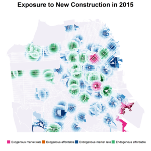
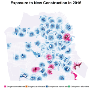
These maps depict new construction in San Francisco, as split up by several types. Help us understand these two maps, and how endogenous and exogenous construction are important distinctions to make for both policymakers and economists.
These maps show the 600-meter radius around new construction projects in 2015 and 2016. They help visualize who might be affected by each new project. The randomly located (exogenous) projects are shown in pink and orange. These are the projects whose impacts I study in the paper. The projects shown in blue and green are not experimentally located; those locations may be “endogenously” driven by developers’ desire to build where prices are already high.
Why did you decide to focus on the local scale of housing, and what does this help to show us?
Focusing on the local scale is important for two reasons: it helps identify a causal relationship, and it directly answers the question of how new housing impacts people living nearby, which is at the center of the policy debate.
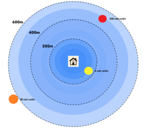
In this figure, we can start to see how you approach this topic through measuring the impacts of new housing spatially. Help us understand this image. How do the effects of new housing differ based on distance?
For each person in my sample, I count up the number of randomly located new projects and new units completed within different distance bins for each year of my study, from 2003-2017. This figure shows how. The circle shows the 600m radius around a fictional person’s house. The yellow dot shows a project built within 200m, so this person would have a value of 1 for the number of projects within 0-200m. They’d have a value of 0 for projects within 200-400m, and 1 for projects within 400-600m (the red dot). Similarly, they would have a value of 6 for net units within 200m, 0 within 200-400m, and 200 within 400-600m.
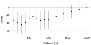
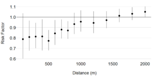
This pair of figures tracks the impact of new construction on rents and displacement. Can you walk us through these charts, and what you were able to measure?
This figure shows the main results. The first panel shows the average relationship between rents and distance from the new market rate construction project in the four years after completion. Rents are roughly $40 lower for people living close to the new building. This effect decays with distance, fading out to zero within two kilometers.
The second panel shows the impact on one measure of displacement: the probability that a renter moves to a lower-income zip code. The risk of moving to a lower-income zip code falls by about 20% for people living close by, and again fades to zero with distance. The renters who live closest to the new projects benefit from the largest differential rent reductions and the largest fall in the risk of displacement. Displacement refers to push migration, when individual people are pushed to leave their current housing. Gentrification refers to the replacement of lower-income incumbents with higher-income newcomers. Displacement happens to people; gentrification happens to places.
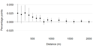
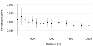
To measure gentrification, the ideal would be to count the net change in the number of richer people at a given address. Since I don’t have individual income data, I use median zip code income as a proxy. I count the net number of people arriving at a given address who came from a richer sending zip code. Panel A shows that the probability of a net increase in richer arrivers — my proxy for gentrification — increases by 2.5 percentage points close to new market rate construction, again fading out with distance. In contrast, panel B shows that new affordable housing doesn’t attract an increase in gentrification.
This final set of figures helps us consider the differences between different kinds of new housing, comparing specifically the differences between affordable and market-rate housing. What is the conventional wisdom on the differences between market rate and affordable housing, and what do these charts and your research more generally suggest for policymakers interested in housing affordability?
One idea that circulates in policy discussions is that market rate housing might cause local price increases and displacement, but affordable housing won’t. Instead, I find that market rate housing differentially decreases nearby rents and displacement risk, while affordable housing has no spillover effects on the surrounding people and neighborhoods. This suggests that affordable and market rate housing are complementary policy levers. Market rate housing can help many people who live nearby, but its price impacts will become less and less effective if the city continues to gentrify and the nearby residents are less sensitive to small changes in rent. On the other hand, affordable housing only prevents displacement for the people living in it, but it does better at targeting people who are really at risk of displacement, and it can preserve long-term income diversity. Both help — and neither hurts.